If you’re launching a business or rebranding an existing one, chances are someone has already told you: start with a mood board. But what does that actually mean when you’re not a designer? How do you go from a Pinterest rabbit hole to a clear visual direction that your designer can actually use?
At Berardo Modern, we work with founders every week who are facing this exact question. This guide breaks down how to create a mood board for branding in a way that’s practical, not precious. No design degree required.
What Is a Brand Mood Board (and Why It Matters)
A brand mood board is a curated collection of visual references such as colors, textures, typography, photography, and design elements that communicates the personality and feeling of your brand before any logo or website is designed.
Think of it as a visual brief. It bridges the gap between what’s in your head and what your designer needs to see in order to deliver work that actually fits your vision.
A well-built mood board will:
- Save hours of back-and-forth with your designer
- Prevent costly revisions later in the process
- Give your team a shared visual language
- Help you make confident decisions about colors, fonts, and imagery
The 7-Step Process to Create a Mood Board for Your Brand
Step 1: Define Your Brand in 3 to 5 Words
Before you collect a single image, write down 3 to 5 adjectives that describe how your brand should feel. Not what it does, how it feels.
Examples:
- A skincare brand: calm, clinical, botanical, honest
- A coffee roaster: warm, crafted, bold, neighborhood
- A B2B SaaS: confident, modern, human, precise
These keywords become your filter. Every image you consider must support at least one of them. If it doesn’t, it doesn’t belong on your board.
Step 2: Know Who You’re Designing For
A mood board isn’t about your taste. It’s about what will resonate with your ideal customer.
Ask yourself:
- Where does my audience already spend time visually? (Instagram, LinkedIn, magazines, etc.)
- What brands do they already trust and love?
- What aesthetic do they associate with quality in my category?
A luxury skincare buyer expects different visuals than a parent shopping for kids’ snacks. Your mood board should speak to them, not just to you.
Step 3: Gather Visual References (The Right Way)
Now you can start collecting. Use tools like Pinterest, Milanote, Figma’s FigJam, Canva, or even a simple folder on your computer.
Pull from a range of sources, not just other brands in your industry. Copying competitors leads to a brand that looks like everyone else.
Good sources include:
- Editorial photography and magazines
- Architecture and interior design
- Fashion lookbooks
- Packaging design from unrelated industries
- Nature, textures, and materials
- Film stills and art
Aim to collect 30 to 50 images at this stage. You’ll cut ruthlessly later.
Step 4: Organize References by Visual Category
Now sort what you’ve gathered. A useful framework we use with clients is built around five visual pillars:
| Category | What to Look For |
|---|---|
| Color Palette | 3 to 6 colors that feel right together |
| Typography | Headlines, body text, accent fonts you admire |
| Photography Style | Lighting, composition, subject matter, mood |
| Textures and Materials | Paper, fabric, surfaces that match your brand feel |
| Design Elements | Patterns, icons, shapes, graphic treatments |
If a category is empty, go back and search specifically for it. A mood board missing typography or texture is incomplete.
Step 5: Cut Down to the Essentials
This is the step most beginners skip, and it’s the most important.
Take your 30 to 50 references and cut them down to 12 to 20 images max. A mood board with too many references becomes noise. A tight board with intentional choices becomes direction.
Use this checklist for each image:
- Does it match at least one of my 3 to 5 brand keywords?
- Would my ideal customer respond to it?
- Is it adding something the other images don’t already say?
If the answer is no to any of those, cut it.
Step 6: Add Commentary and Context
Your designer can’t read your mind. Next to each image (or group of images), add a short note explaining why it’s there.
Examples of useful commentary:
- “I love the warm, off-white background, not the actual product.”
- “This is the typography energy I want, bold but not aggressive.”
- “The lighting in this photo is what our product imagery should feel like.”
This single step transforms a Pinterest board into a real creative brief.
Step 7: Translate the Mood Board into Brand Direction
A mood board is only useful if it leads to decisions. Once your board is finalized, extract concrete direction from it:
- Color palette: Pick the dominant and accent colors that keep appearing
- Typography pairings: Identify whether your brand needs a serif, sans-serif, or mix
- Photography rules: Note lighting, framing, and subject style
- Tone of voice cues: Yes, visuals influence voice. A clinical board suggests clear, precise copy; a warm board suggests conversational copy
- What to avoid: List 3 to 5 visual styles your brand should never look like
Hand this, along with the mood board itself, to your designer. You’ve just made their job dramatically easier and your final brand dramatically stronger.
Common Mistakes to Avoid
- Copying one brand too closely. Your board should reflect your brand, not be a tribute to another company.
- Only collecting logos. A mood board is about feeling, not finished design work.
- Too many directions. If your board has minimalist Scandinavian images next to maximalist 70s posters, you haven’t made a decision yet.
- No input from your audience. Show the board to a few people in your target market before locking it in.
- Treating it as final. A mood board is a starting point, not the brand itself.
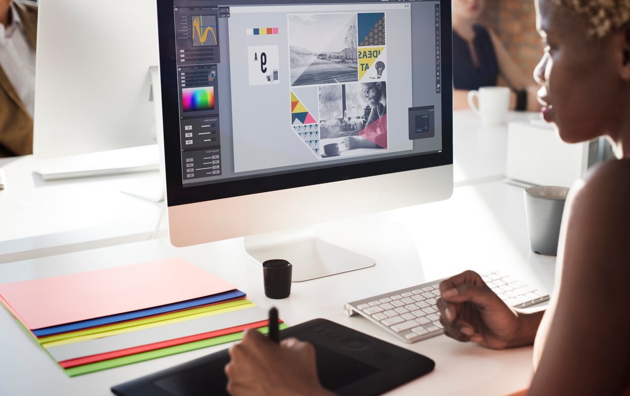
Tools We Recommend in 2026
- Pinterest: Best for early-stage collection
- Milanote: Best for organizing by category with notes
- Figma / FigJam: Best for collaborating with your designer
- Canva: Best for quick visual presentation
- Are.na: Best for thoughtful, less algorithm-driven curation
FAQ
What are the three main components of a brand mood board?
The three core components are color, typography, and imagery. A complete board also includes textures and design elements, but if you nail those three, you have a strong foundation.
How many images should a mood board have?
Between 12 and 20 carefully chosen images. Less than that often lacks direction; more than that becomes visually overwhelming and dilutes your intent.
Can I create a mood board without any design software?
Yes. A Pinterest board, a Google Slides deck, or even a physical board with printed images all work. The platform matters far less than the thinking behind your choices.
Should I show my mood board to my customers before finalizing?
It’s a good idea to show it to 3 to 5 people in your target audience. You’re not asking them to design it, you’re checking whether the feeling matches what they expect from a brand they’d trust.
How long should the mood board process take?
For most small business owners, plan on 1 to 2 weeks. Spend the first few days collecting broadly, then take time to cut, organize, and add commentary. Rushing this step usually means rework later.
Ready to Turn Your Mood Board Into a Real Brand?
A mood board is the foundation, but it’s just the beginning. If you’d like help translating your visual direction into a full brand identity that actually performs, our team at Berardo Modern works with founders and small business owners to build brands with clarity and intention. Get in touch and let’s talk about your project.