
Author name: Bernice Berardo

Web design

10 Website Design Trends That Will Make Your Site Stand Out in 2023

If you want your website to stand out in the crowded digital space, you should embrace the latest design trends. The best way to increase engagement and conversions is to ensure the web pages are user-friendly and highly functional. Think about it – you want to give your brand a cutting-edge status by incorporating elements and inventive features set to gain traction in the coming years. Let’s look at the 10 website design trends 2023 has to offer. 1. Immersive 3D worlds A website houses information about your customers – you don’t want it to have an outdated appearance. Thanks to VR tech, many websites do their best to pull viewers onto a page. While audio techniques look like tacky relics, brands are trying to add a cinematic touch to their web pages. Some incorporate 3D models into the mix. With 3D web design, you can add details like: Dynamic text Graphics Interactive scrolling 2. Layering Layering adds a sense of depth to a website. Brands are also using colors and shapes to tell their story. As you add the layers, you should not interfere with the loading rate. 3. Animation stimulation Animations have taken over the web, and that’s why you should make them part of your website design. You can add buttons that change colors or include sliding galleries. Another common trend is simple animations highlighting when you click on them. The idea is to ensure your visitors stay on the page as they peruse through the products. 4. Overlapping images and texts Brands are overlapping texts beneath each title. This helps to minimize space on each page while leaving a lasting impression on visitors. Websites arrange texts and impactful words that engage just like attention-hungry visuals. Focus on creating a bridge where visitors can connect with the content. 5. Voice-activated interface Some brands use voice-over interfaces like Google Assistance, Apple’s Siri, and Amazon Alexa. If you’ve been on the lookout, tech giants continue to develop voice-enabled assistants. What does this mean to your website? By incorporating voice-activated technology, your customers will communicate easily rather than spend time typing. Even better, voice interactions allow for multitasking, like driving, cooking, exercising, etc., as customers make their purchases. 6. Scrapbook aesthetic Websites are using sticker graphics, handwritten layering, and doodle drawings to bring an old-school vibe. To ensure the handmade aesthetic doesn’t ignore the digital world, there’s an aspect of futurism. 7. Text only Websites are now using a few choices of words to show their products. In the coming days, brands will substitute traditional text searches with unique text. The goal is to ensure customers get the most essential information. Seize the moment and transform your web design—snag the exclusive , unlocking a world of possibilities at an unbeatable value. 8. Dynamic cursors If you want to create a sense of delight for your customers, you must think beyond the humble cursor. A dynamic cursor will bring a touch of personality and clear visual indications of web page actions. For instance, you can introduce the cursor-triggered animation that visitors enjoy. You could also have a cursor that ensures browsers download only the visible content. 9. Use of Chatbots Chatbots have been around for a while and continue to be more sophisticated as AI tools take over the digital space. You can design a website that allows chatbots to process customer requests. After all, your website contains information you want visitors to know. But today’s customers want a magic button instead of digging around for answers. Here are reasons why Chatbots should be part of your web design: They eliminate the need for a customer representative They convert visitors into customers They personalize customer experience 10. Strong typographical layouts Some brands are using bold text that grabs customers’ attention. With highlighted texts, you can incorporate your videos and images in the same composition. At the very basic, embracing a typographical layout brings a sense of minimalism to your website.

10 Website Design Trends That Will Make Your Site Stand Out in 2023 Read More »
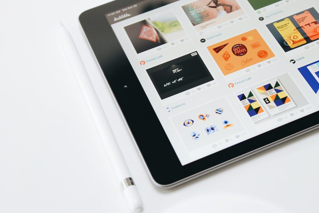
Graphic Design

6 Principles of Minimalist Graphic Design

Minimalistic design is one of the best ways to capture the viewer’s attention. Additionally, it can help you put your point across without including unnecessary design elements. Not to speak of the time it saves and the efficiency it brings. It might seem simple, but minimalistic graphic design requires a lot of practice and discipline. The six principles of the minimalistic graphic design below will serve as a starting guide. 1. Leave plenty of space The number of elements and text in a minimalistic design is pretty limited. Still, it makes sense to emphasize these elements so that the reader or the viewer gets the message. The easiest way is to leave plenty of space around the main elements. Doing so offers a few benefits: The emphasis on the elements is increased. It becomes easy to scan or read the elements in the design. 2. Go with a flat design Flat design offers numerous advantages like: It increases legibility. Makes the text and elements easy to read/view on any device. Reduces the elements in the design. The user interface becomes simplistic and more user-friendly. On the contrary, if you do not use a flat design, the number of elements will drastically go up, and you cannot label that design as a minimalistic one. 3. Balance it out A minimalistic design doesn’t mean including a couple of elements in the entire design because of the limitation on the number of elements. Even though the number of elements or text is limited, but still need to balance it out in multiple planes like: Horizontal balance Vertical balance Diagonal balance Background and foreground balance In each of these planes, roughly the same amount of text or elements should be placed. Doing so ensures that even though you’re following minimalistic graphic design principles, the design still looks aesthetically pleasing and captures the attention of the viewer. 4. Grids to the rescue Sometimes, you need to include a considerable bit of information on elements, even when following the principles of minimalistic design. In that case, instead of haphazardly inserting the elements, use the grids. They offer advantages like: Complete control over the text or elements Extreme flexibility Makes the content easy to read Establishes visual hierarchy Great for viewing the design on any device Naturally creates content breakpoints As a designer, one has complete freedom to create the type of grid one prefers. The cells, the size, the columns, and the rows can be modified as per data or elements. 5. Minimize the elements Minimalistic graphic design works on the principles of less is more. To stick to the same, follow the rules like: No over-the-top decoration No unnecessary design elements No long-form text No clutter If, as a designer, you aren’t accustomed to minimalistic design, create the first draft and remove the unnecessary elements and text. Keep on repeating the process until only the most necessary elements are present in the design. While this might require 4 to 5 revisions, if not more but following this rule will make you a better designer and help you ace minimalistic design. 6. Simplicity is the key Minimalistic design is simplistic. In fact, if you want to convey your point strongly through design, minimalistic is the best option since it doesn’t consist of unnecessary elements. The simplicity should stick to every element of the design like: Background Text fonts Text colors Design elements Special effects (if any) Time to use the effectiveness of minimalist graphic design for yourself and your clients. Stick to these six principles, and you will be ahead of most graphic designers claiming to use minimalistic designs.

6 Principles of Minimalist Graphic Design Read More »

Social Media Marketing Mistakes

Biggest Mistakes You Can Make With Social Media Marketing

As so many people are engaged in social media right now, it has become one of the best platforms to market your business. Small and big businesses alike benefit from social media marketing and if your business is yet to make its mark there, you’re missing out on big things. There are billions of users on Facebook alone already. Think of how big a reach you have locally once your business is put on one of the major social media platforms. There are lots of mistakes that you can make when doing social media marketing. Those can gravely affect your reputation online. If you don’t want to destroy your business’s image, then here are the biggest mistakes that you should avoid. 1.   Not Boosting Your Posts One of the best things about the Facebook business platform is that you can boost your post so that it can reach more people. Even better is the fact that you can boost the post to reach a certain amount of people who are within your defined market. The catch is that post boosting isn’t free. The good news is that it isn’t expensive too. You can boost a post for a few dollars as well. Some marketers argue that it isn’t worth it to boost posts on Facebook but if it helps you reach even a bit more people, then it’s definitely worth considering. 2.   Not Getting Verified Badges People are very discerning when it comes to the pages and accounts they engage with on social media. Luckily, most social media platforms now have Verified badges that tell people when the page or account is legit and not a fake one. Luckily, getting Verified on platforms like Twitter and Facebook is free and easy. In most cases, all you really need to do is to send a few documents and you’re good to go. It’s best to have your accounts verified as soon as you can so that people know that it’s the official account for that business. 3.   Neglecting Community Guidelines All social media platforms have rules that you need to follow. If your business page doesn’t abide by these rules, there’s a good chance that you’ll be penalized. Having the penalties turned is possible for first time offenders but it’s a long process. Repeat offenders can have their accounts permanently removed so your progress will be lost indefinitely. Make sure to read the terms and regulations of each social media platform that you focus on. Losing all of your progress because of a post that goes against the rules can be very frustrating and debilitating for your business. 4.   Not Engaging With Your Customers One of the biggest benefits of social media marketing is that you can engage with your customers directly using it. If you don’t use that part of social media, then what’s the point of using social media marketing in the first place? Something as simple as responding to comments on posts goes a long way. Not only does it make your customers feel that they’re talking to people and not just a page, it also drives engagement for your posts so it appears on the feed of others even more. Social media marketing is one of the biggest blessings for businesses. It’s easy to fail in it just as easy it is to succeed in it. Avoiding these major mistakes will ensure that you’re getting the most out of your business page so make sure to take these 4 things to heart before you post.

Biggest Mistakes You Can Make With Social Media Marketing Read More »

About Us

We believe that every business deserves a strong brand identity. Whether you’re starting a new business or rebranding an existing one, we can help you develop a unique brand identity that will make you stand out from the competition.

Contact Info

Subscribe Now

You have been successfully Subscribed! Ops! Something went wrong, please try again.

Copyright © 2022 Berardo Modern Digital. All Rights Reserved.